This article is one of our series of e-commerce websites that we are user testing and reviewing.
Lazada trying to close the gap of online and offline shopping. What’s new and what can we learn from?
A few months back, Lazada launched a new site in Singapore along with a new logo. The site design is a revamp of previous design (picture below). Lazada brings the ‘categories-by-floors’ shopping experience onto their homepage, a concept that most offline shoppers are familiar with.
Nonetheless, we also see improvement on user experience (UX) with the new design. Below we summarized the e-shopping journey and experience of users on Lazada Singapore website.
Product Scouting
Search function can be seen clearly at the top of the page and product categories on the left side.
Things That Worked Well
The product category range is huge and that shows that Lazada sells a wide range of items – toys, beauty, fashion, technology, sports and home appliances to name a few. The homepage is arranged in such a way where promotions of each category are on the homepage.
Although there are many promotions going on, the homepage is not too loaded or cluttered. Products on promotion can be seen clearly.
Upon clicking on ‘Mobiles & Tablets’ category, the page revealed the products available along with promotions that are being offered. Promotions are being displayed in a small circle that shows you how much the product is being discounted.
On the left column, there are a number of filtering options, consumers can filter based on colour, brand or even price. These filtering options allow customers to narrow down and be presented with a manageable number of items to choose from, rather than being confronted with a thousand items to choose from.
This saves customer’s time. Speed is one crucial user experience in winning against market competition. More importantly, the variety of filters put in place acknowledges that different consumers have different ways of navigating a website.
Things That Need Improvement
However, the search function is not very useful. It turns out that the search function is not defined enough because it resulted in unrelated products as well.
Purchasing A Product
Things That Worked Well
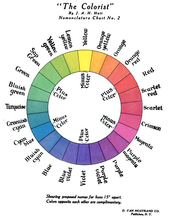
Moving on, after selecting the product users are interested, a big orange coloured box with the word ‘Buy Now’ is clearly visible to users. This is how the principle of visual hierarchy is being applied where elements on the web page is arrange in a way that implies importance. The bigger size of the ‘Buy Now’ button also makes it a primary Call to Action even though the ‘search’ button has the same orange color. You will also notice that orange color is used because it is an opposite and contrasting color to blue on the website (illustrated from the color wheel shown below). This allow the orange button to stand out and attract the viewer’s initial attention. An strategic use of color and size is how one could create a strong call to action on their homepage, thus increasing conversion rate.

The ‘how to buy’ button is also very helpful, especially for first time buyers because it gives users an idea of how their purchasing process works.
Things That Need Improvement
Besides that, there are two issues that may be confusing.
- The name of the product and by whom (just right below the product’s name)
- The product is available by who (on the right side written ‘Sold & Fulfilled by’)
For instance, the HTC One smartphone by HTC but users do not realized that the smartphone is sold and will be delivered by BQ_SHOP. Users actually thought that they are buying from HTC.
In relation to that, there are little to no information about the seller. Thus, providing some information about the seller is certainly helpful and could boost sellers’ credibility and buyer’s confidence in making the purchase.
Checkout!
The checkout process was very smooth. Users are given the option to check out without an account (duh), thus eliminating the tedious process of signing up which could take a couple of minutes and possibly frustrates users. Address is also differentiated based on city, region and postcode which further smoothens the checkout process.
Overall, Lazada Singapore is a pretty good e-commerce website in terms of product offerings and the usability of the site. There are minor issues that need to be refined.
Note: Changes to the website may have occurred since UX Testing was done.

